

variation....

Welcome guest, is this your first visit? Click the "Create Account" button now to join.

Results 16 to 30 of 39
-
02-09-2009, 08:39 AM #16
 Registered User
- Join Date
- Feb 2006
- Location
- San Antonio, TX
- Posts
- 2,024
To disable ads, please log-in.
OK, sorry. Perhaps as an admin you could move all the non-submission stuff to the other thread. Originally Posted by Susan Otcenas

-
02-09-2009, 12:31 PM #17
Registered User
- Join Date
- Jul 2007
- Location
- Seattle
- Posts
- 315
Last edited by ttaylor508; 02-09-2009 at 03:42 PM.
-
02-09-2009, 01:45 PM #18
Registered User
- Join Date
- Feb 2009
- Posts
- 1
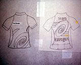
Mine is very simple and looks like a "team" jersey but I thought I'd throw my hat in anyway. I wanted to make it loud yet subdued and make the TE logo prominent. There are endless color combinations...
I just realized ttaylor has something similar, I didn't mean to bite your style! I didn't even realize! Sorry!Last edited by velowoman; 02-09-2009 at 02:24 PM.
-
02-11-2009, 06:58 AM #19
URLea
- Join Date
- Apr 2008
- Location
- Fargo, ND
- Posts
- 444
This is for those that wanted something brighter and more like a traditional jersey. It could come in about any color you can think of, but i chose this color for visibility. Of course the back pocket could also be the same color as the jersey, but I was thinking of trying to slim out love-handles by using the black.
The swirls by the wheels are to imply motion & soften up the design.

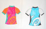
And this is a little more girly. Uploaded larger so you could read the text on the petals. If you have ideas of what to put on the petals instead let me know!

Now back to using PhotoShop for what it was intended for in my day-to-day routine, work. This has been fun!
For more details, check out my blog! http://stubborntriathlete.blogspot.com/
This has been fun!
For more details, check out my blog! http://stubborntriathlete.blogspot.com/
For all the randomness, follow me on twitter! http://twitter.com/ShootRunTri
-
02-11-2009, 10:17 AM #20
Registered User
- Join Date
- Feb 2009
- Location
- Melbourne, Australia
- Posts
- 507
OK this contest actually motivated me to get out on long term lurker mode (also a bit too much free time on my hands). Guess I'd better start making some contributions in discussions from now on.
I do like Primal Wear jerseys designs... so that's a bit of the flavour. I have also added gradient background colours but they can be solid as well, plus the background colours can be changed (just that I know pink or blue will normally appeal to most).
Thanks for the opportunity to enter!
-
02-11-2009, 12:38 PM #21
Registered User
- Join Date
- Jul 2007
- Location
- Seattle
- Posts
- 315
-
02-11-2009, 12:54 PM #22
pedaling my heart away
- Join Date
- Sep 2007
- Location
- Boston, MA
- Posts
- 646
Mine are not even in color :p
Here are mine

I can't figure out how to post them in the thread
I really liked the idea of having the globe in the background Or the globe with wheels filling in the area of the land parts
My apologies for my technical ignorance
Last edited by Ana; 02-11-2009 at 01:20 PM.
Ana
* * * * * * * * * * * * * *
2009 Lynskey R230
Trek Mountain Track 850
-
02-11-2009, 06:47 PM #23
URLea
- Join Date
- Apr 2008
- Location
- Fargo, ND
- Posts
- 444
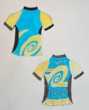
Here you go Ana...
 For more details, check out my blog! http://stubborntriathlete.blogspot.com/
For all the randomness, follow me on twitter! http://twitter.com/ShootRunTri
-
02-11-2009, 07:55 PM #24
URLea
- Join Date
- Apr 2008
- Location
- Fargo, ND
- Posts
- 444
Here's my best shot a brighter alternative as you suggested. Tried lightening it up by turning the back pocket white too. It's hard to get a feel for how the design would look with the texture of the fabric, but I think that the white might actually work here.
 For more details, check out my blog! http://stubborntriathlete.blogspot.com/
For all the randomness, follow me on twitter! http://twitter.com/ShootRunTri
-
02-12-2009, 03:44 PM #25
zippadee-doo-dah
- Join Date
- Apr 2007
- Location
- Limbo
- Posts
- 8,769
Rollover thumbnails-
 Basic design (I told you it was similar...and rough))
 messing with color
I'm also playing with another design2008 Trek FX 7.2/Terry Cite X
2009 Jamis Aurora/Brooks B-68
2010 Trek FX 7.6 WSD/stock bontrager
-
02-13-2009, 01:03 PM #26
Registered User
- Join Date
- Dec 2008
- Location
- Southeast South Dakota
- Posts
- 20
Historically Inspired Submission
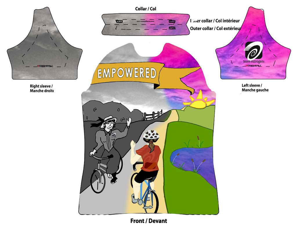
I was thinking about the bicycle and it's early contribution to women's liberation. I wanted to try to illustrate that idea in a way, and make something that looks a bit like a vintage bicycle poster.
This is what I've been doing instead of cleaning today. And yesterday. I don't have illustrator at home. I drew the image and then cleaned it up and colored it in in Photoshop.
I still need to create the jersey back and sides.
The idea is that the banner would be high enough on the shirt to come across the upper chest. And, I'm hoping that the cyclists are low enough to be mostly across the abdomen.
Feedback is welcome. Even if this doesn't win... it's good to have a project to work on just for fun sometimes.
-
02-15-2009, 08:00 AM #27
Registered User
- Join Date
- Jun 2008
- Location
- Wellesley, MA
- Posts
- 361
Here's version 1... a second is on it's way...

-
02-16-2009, 09:16 AM #28
Registered User
- Join Date
- Jun 2008
- Location
- Wellesley, MA
- Posts
- 361
Version 2.... Colors of course could be changed...

-
02-16-2009, 09:58 AM #29
Registered User
- Join Date
- Dec 2008
- Location
- Southeast South Dakota
- Posts
- 20
My Whole Jersey
I tweaked a few things on my jersey. It could still use some work I know. But, it's the best that I have at the moment.
I was thinking... Would it be possible to add some illumnite to the lighter paint? It seems like a jersey could maintain some color and have something with reflective qualities added to it...
Here's a link to the image in photobucket in case you'd like to see a larger version.
Edited to say that the image that the link takes you to seems to have odd color. The colors in this posted image are correct. The thumbnail in photobucket is even accurate, but the enlarged image is not.Last edited by Ha(m)mer; 02-16-2009 at 10:02 AM.
-
02-16-2009, 11:39 AM #30
Registered User
- Join Date
- Jun 2003
- Location
- MI
- Posts
- 2,543
My stab at it . . .
I read some comments about visibility being important to people so I made the back panel yellow. I like simple, graphic look, so that's what I did.
Last edited by limewave; 12-22-2011 at 08:25 AM.
2005 Giant TCR2
2012 Trek Superfly Elite AL 2nd Sport, Pando Fall Challenge 2011 and 3rd Expert Peak2Peak 2011
2001 Trek 8000 SLR
Iceman 2010-6th Place AG State Games, 2010-1st Sport, Cry Baby Classic 2010-7th Expert, Blackhawk XTerra Tri 2007-3rd AG
Occasionally Updated Blog